Plot Raster Data
Last updated on 2024-03-12 | Edit this page
WARNING
Warning in
download.file("https://www.naturalearthdata.com/http//www.naturalearthdata.com/download/110m/physical/ne_110m_graticules_all.zip",
: cannot open URL
'https://www.naturalearthdata.com/http//www.naturalearthdata.com/download/110m/physical/ne_110m_graticules_all.zip':
HTTP status was '500 Internal Server Error'
ERROR
Error in download.file("https://www.naturalearthdata.com/http//www.naturalearthdata.com/download/110m/physical/ne_110m_graticules_all.zip", : cannot open URL 'https://www.naturalearthdata.com/http//www.naturalearthdata.com/download/110m/physical/ne_110m_graticules_all.zip'Overview
Questions
- How can I create categorized or customized maps of raster data?
- How can I customize the color scheme of a raster image?
- How can I make my visualizations interactive?
Objectives
- Build customized plots for a single band raster using the
ggplot2package. - Make interactive maps with leaflet
First, let’s load some libraries. You should have them loaded from the previous less, but in case you don’t -
R
library(terra)
library(tidyterra)
library(ggplot2)
library(dplyr)
We are also going to load one new library.
R
library(leaflet)
To remind you, this is the data we will be using -
R
# Learners will have this data loaded from earlier episode
# DSM data for Harvard Forest
b10_casco_2023 <-
  rast("data/landsat_casco/b10_cropped/LC09_L2SP_011030_20230920_20230922_02_T1_ST_B10.TIF") |>
  clamp(lower = 50,
        upper = 75)

b10_casco_2023_df <- as.data.frame(b10_casco_2023, xy = TRUE)
Things You’ll Need To Complete This Episode
See the lesson homepage for detailed information about the software, data, and other prerequisites you will need to work through the examples in this episode.
Plot Raster Data in R
This episode covers how to plot a raster in R using the
ggplot2 package with customized coloring schemes. We will
then make interactive maps with leaflet.
We will continue working with the Landsat SST data from Casco Bay.
Plotting Data Using Breaks
In the previous episode, we viewed our data using a continuous color
ramp. For clarity and visibility of the plot - or if there are classes
you are interested in - we may prefer to view the data “symbolized” or
colored according to ranges of values. This is comparable to a
“classified” map. To do this, we need to tell ggplot how
many groups to break our data into, and where those breaks should be. To
make these decisions, it is useful to first explore the distribution of
the data using a bar plot. To begin with, we will use
dplyr’s mutate() function combined with
cut() to split the data into 4 bins.
R
b10_casco_2023_df <- b10_casco_2023_df %>%
                mutate(fct_sst = cut(SST_F_20230920, breaks = 4))

ggplot() +
    geom_bar(data = b10_casco_2023_df, aes(fct_sst))
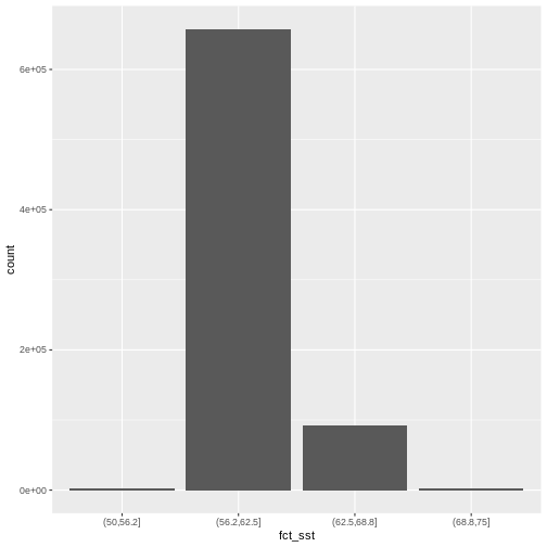
If we want to know the cutoff values for the groups, we can ask for
the unique values of fct_sst:
R
unique(b10_casco_2023_df$fct_sst)
OUTPUT
[1] (62.5,68.8] (68.8,75]   (56.2,62.5] (50,56.2]
Levels: (50,56.2] (56.2,62.5] (62.5,68.8] (68.8,75]
And we can get the count of values in each group using
dplyr’s group_by() and count()
functions:
R
b10_casco_2023_df %>%
        group_by(fct_sst) %>%
        count()
OUTPUT
# A tibble: 4 × 2
# Groups:   fct_sst [4]
  fct_sst          n
  <fct>        <int>
1 (50,56.2]     2370
2 (56.2,62.5] 657710
3 (62.5,68.8]  92571
4 (68.8,75]     2461
We might prefer to customize the cutoff values for these groups. Lets
round the cutoff values so that we have groups for the ranges of 50 –
55F, 55 – 60F, 65 - 70F and 70-75F. To implement this we will give
mutate() a numeric vector of break points instead of the
number of breaks we want.
R
custom_bins <- c(50, 55, 60, 65, 70, 75)

b10_casco_2023_df <- b10_casco_2023_df %>%
  mutate(fct_sst_2 = cut(SST_F_20230920, breaks = custom_bins))

unique(b10_casco_2023_df$fct_sst_2)
OUTPUT
[1] (65,70] (70,75] (60,65] (55,60] (50,55] <NA>
Levels: (50,55] (55,60] (60,65] (65,70] (70,75]
cut() is a powerful function, and there are a series of
related ones that are quite useful.
| function | what it does |
|---|---|
| cut | makes groups based on pre-defined breakpoints |
| cut_interval | makes n groups with equal range |
| cut_width | makes groups with a given width |
| cut_number | makes n groups with an equal number of observations |
Try them out with b10_casco_2023_df$SST_F_20230920 to
see how they differ.
And now we can plot our bar plot again, using the new groups:
R
ggplot() +
  geom_bar(data = b10_casco_2023_df,
           mapping = aes(fct_sst_2))
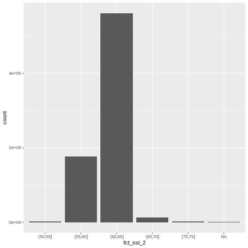
And we can get the count of values in each group in the same way we did before:
R
b10_casco_2023_df %>%
  group_by(fct_sst_2) %>%
  count()
OUTPUT
# A tibble: 6 × 2
# Groups: fct_sst_2 [6]
fct_sst_2 n
<fct> <int>
1 (50,55] 1483
2 (55,60] 176310
3 (60,65] 562050
4 (65,70] 13284
5 (70,75] 1715
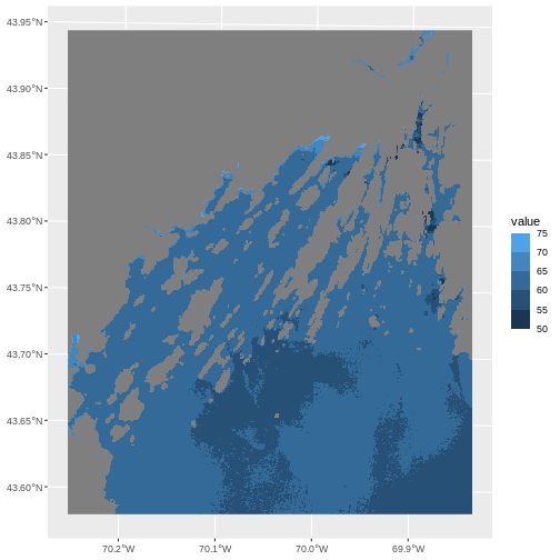
6 <NA> 270We can use those groups to plot our raster data, with each group
being a different color. We could do this with our data frame, or, we
can use the scale_color_binned() color scale. This is a
feature of ggplot2 that lets you create bins on the fly and
plot them. We can specify our custom breaks with the breaks
argument.
R
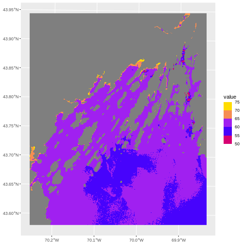
ggplot() +
  geom_spatraster(data = b10_casco_2023) +
  scale_fill_binned(breaks = custom_bins)
A lot of color scales have binned versions. We could have done the
above with scale_fill_viridis_b(). Or we could place with
scale_fill_fermenter() which comes from Color Brewer.
R
ggplot() +
  geom_spatraster(data = b10_casco_2023) +
  scale_fill_fermenter(breaks = custom_bins,
                       palette = "Accent")
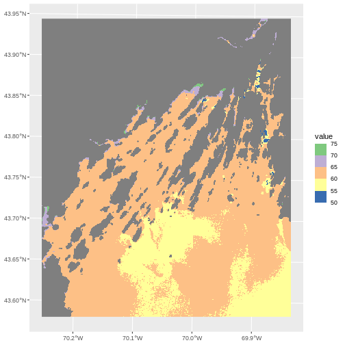
Note the choices of palette. ColorBrewer supplies quite a few to try!
R
RColorBrewer::display.brewer.all()

This is just the tip of the iceberg when looking for color palettes
for R, and it’s a topic well worth searching out when you want to
customize your own plots to the nth degree. You can even make your own
custom palette with scale_fill_stepsn().
R
my_pal <- c("red", "blue", "purple", "orange", "yellow")

ggplot() +
  geom_spatraster(data = b10_casco_2023) +
  scale_fill_stepsn(breaks = custom_bins,,
                    colors = my_pal)
One advantage to this is that you can then use the same breaks and
color palette across multiple plots for consistency, rather than having
ggplot2 choose the breaks and palette stretching for you.
There are also many wonderful palette packages, like wesanderson or beyonce.
More Plot Formatting
All labels in a plot can be controlled by the labs()
function. So, if we wanted to give the fill name “SST (F)”, label the X
and Y axis, and give this plot a title of “SST on Sept 9, 2023” we can
do so easily.
R
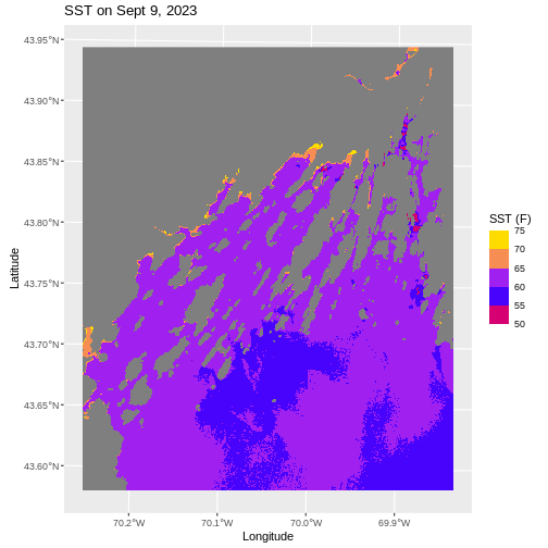
ggplot() +
  geom_spatraster(data = b10_casco_2023) +
  scale_fill_stepsn(breaks = custom_bins,,
                    colors = my_pal) +
  labs(title = "SST on Sept 9, 2023",
       x = "Longitude", y = "Latitude",
       fill = "SST (F)")
We can also retheme the entire plot - changing the background, axis options, and more. If you really want to get deeply into themes, there are many wonderful packages out there like ggthemes, tvthemes, hrbrthemes, ggsci, and so many more.
Within ggplot itself, chekc out the different theme_*()
functions, such as theme_void(). We can use the
base_size argument to specify a base font size as well.
R
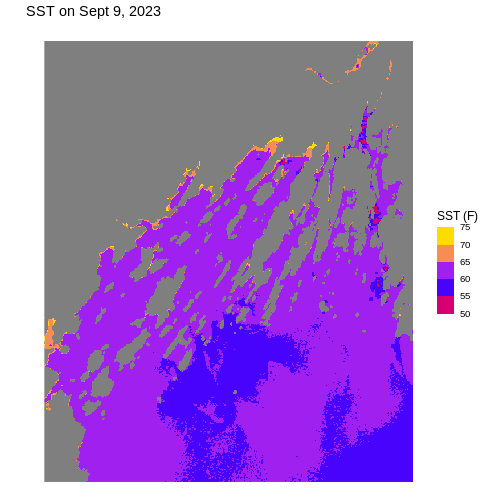
ggplot() +
  geom_spatraster(data = b10_casco_2023) +
  scale_fill_stepsn(breaks = custom_bins,,
                    colors = my_pal) +
  labs(title = "SST on Sept 9, 2023",
       x = "Longitude", y = "Latitude",
       fill = "SST (F)") +
  theme_void(base_size = 12)
You can also make your own custom theme or theme modifications with
the theme() function. Dig into the ?theme
helpfile to learn more and see examples.
Challenge: Plot Using Custom Breaks
Create a plot of the Casco Bay SST in August 2013 that has:
- Three classified ranges of values (break points) that are evenly divided among the range of pixel values. Any palette you’d like!
- Axis labels.
- A plot title.
- A unique theme.
The file is
data/landsat_casco/b10_cropped/LC08_L2SP_011030_20130815_20200912_02_T1_ST_B10.TIF
to remind you.
R
b10_casco_2013 <- rast("data/landsat_casco/b10_cropped/LC08_L2SP_011030_20130815_20200912_02_T1_ST_B10.TIF")

# find intervals
cut_interval(values(b10_casco_2013), n = 3) |> levels()

# round those intervals into breaks
new_breaks <- c(50, 65, 75, 85)

# plot with these new breaks using Set2 as the palette

ggplot() +
  geom_spatraster(data = b10_casco_2013) +
  scale_fill_fermenter(breaks = new_breaks,
                    palette = "Set2") +
  labs(title = "SST on Aug 15, 2023",
       x = "Longitude", y = "Latitude",
       fill = "SST (F)") +
  ggthemes::theme_few()
Interactive Maps
These static maps are beautiful, but, they can be difficult if you notice features occurring at small scales you want to investigate. They’re also wonderful objects to build for web applications and the like, as they allow users a degree of interactivity.
For a basic level of interactivity - just to explore -
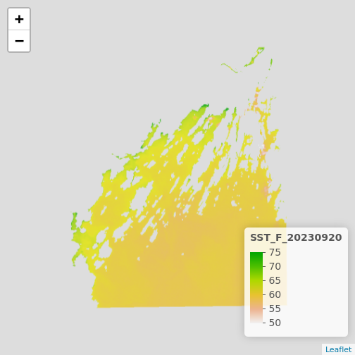
terra includes a function called plet() which
lets us look at our raster interactively.
R
plet(b10_casco_2023)
This is great, and we can even put some reference behind it with the
tiles argument.
R
plet(b10_casco_2023, tile = "Esri.WorldImagery")
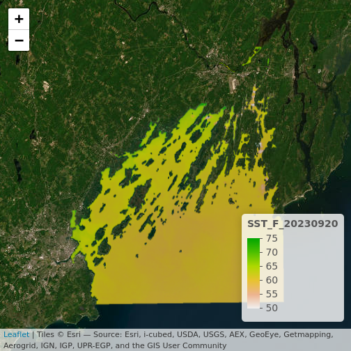
What do you learn from this?
R
plet(b10_casco_2023, tile = "Street")
Data Tips
If you want to make sure things can be seen behind the raster, try
fiddling with the alpha values. It’s set to 0.8 by default
The alpha value determines how transparent the colors will be (0 being
transparent, 1 being opaque).
There are other options for plet that could be well
worth an exploration as you use it to try and understand what is
happening in your raster imagery.
The above is well and good for exploration, but for presentation you
might something more customized. Did you notice in the lowe right-hand
corner the word “leaflet”? This is the name of a Javascript library that
powers a lot of interactive maps you see on the internet.
plet() actually calls an R library leaflet
that then interacts with the Javascript library to make these maps. You
can learn a lot more about leaflet for R from here.
The leaflet library works in some very similar and some
very different ways from ggplot2. It’s useful to know as it
allows us to customize the presentation of our maps for a public
audience. It works by building a map up in a sequence of layers, like
ggplot2, except that it uses the pipe to add each new
element. For example, to generate the above map, we’d have to first
initialize a leaflet() map, then addTiles(),
and finally addRasterImage().
R
library(leaflet)

leaflet() |>
  addTiles() |>
  addRasterImage(b10_casco_2023)
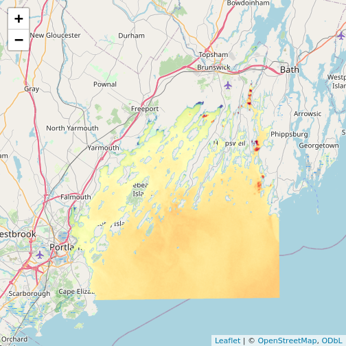
Note that the color palette is different as is the background map
from plet(). This is all customizable!
addTiles() takes an argument urlTemplate
which looks a bit odd, but, you can get the arguments for different
tilesets from this
site. Or use addProviderTiles() to just specify a
provider and map.
R
leaflet() |>
  addProviderTiles("Esri.WorldImagery") |>
  addRasterImage(b10_casco_2023, opacity = 0.8)

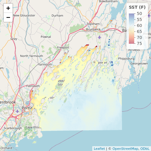
For colors, we can specify a color mapping - from our raster to a
palette. There are four functions for this. colorNumeric()
is for continuous values. colorBin() does what we’ve been
doing with scale_fill_binned(). We can use discrete values
with colorFactor() or if we want to use quantiles (e.g., to
highlight 95th percentiles and extremes beyond them), we can use
colorQuantile(). Each takes a palette, which we can either
specify as a vector of colors or a name of a ColorBrewer or Viridis
palette. It also takes a domain, the values the palette will be mapped
to.
What’s great about defining a palette here is that we can then use it
for addLegend() or for other maps to have equivalent
scales. Here’s an example using the RdYlBu palette. Don’t
forget to set na.color = "transparent" if you don’t want to
see it.
R
# note, using reverse = TRUE here as otherwise warm = blue
my_pal <- colorNumeric(palette = "RdYlBu",
                    domain = values(b10_casco_2023),
                    na.color = "transparent",
                    reverse = TRUE)

leaflet() |>
  addTiles() |>
  addRasterImage(b10_casco_2023,
                 colors = my_pal) |>
  addLegend(pal = my_pal,
            values = values(b10_casco_2023),
            title = "SST (F)")
R
# Let's do bins!
new_pal <- colorBin(palette = "plasma",
                    domain = values(b10_casco_2013),
                    na.color = "transparent")

leaflet() |>
  addProviderTiles("Esri.WorldTerrain") |>
  addProviderTiles("Thunderforest.SpinalMap") |>
  addProviderTiles("Esri.WorldImagery") |>
  addRasterImage(b10_casco_2013,
                 colors = new_pal,
                 opacity = 0.7) |>
  addLegend(pal = new_pal,
            values = values(b10_casco_2013),
            title = "SST (F)") |>
  addScaleBar("bottomleft") |>
  addLayersControl(position = "bottomright",
                   baseGroups = c("World Terrain",
                                  "This Is Spinal Map!",
                                  "World Imagery"))
Key Points
- Continuous data ranges can be grouped into categories using
mutate()andcut()or with a binned color scale inggplot2. - Use built-in color palettes with
scale_fill_viridis_borscale_fill_fermenter()or set your preferred color scheme manually. - Interactive plotting with
plet()and theleafletlibrary can lead to even better insights as you zoom in and out.