Plot Multiple Vector Layers
Last updated on 2024-03-12 | Edit this page
WARNING
Warning in
download.file("https://www.naturalearthdata.com/http//www.naturalearthdata.com/download/110m/physical/ne_110m_graticules_all.zip",
: cannot open URL
'https://www.naturalearthdata.com/http//www.naturalearthdata.com/download/110m/physical/ne_110m_graticules_all.zip':
HTTP status was '500 Internal Server Error'
ERROR
Error in download.file("https://www.naturalearthdata.com/http//www.naturalearthdata.com/download/110m/physical/ne_110m_graticules_all.zip", : cannot open URL 'https://www.naturalearthdata.com/http//www.naturalearthdata.com/download/110m/physical/ne_110m_graticules_all.zip'Overview
Questions
- How can I make different vecotr layers line up?
- How can I plot multiple forms of vector data together?
Objectives
- Plot multiple vector layers in the same plot.
- Apply custom symbols to spatial objects in a plot.
- Create a multi-layered plot with raster and vector data.
Things You’ll Need To Complete This Episode
See the lesson homepage for detailed information about the software, data, and other prerequisites you will need to work through the examples in this episode.
This episode builds upon the previous episode to work with vector layers in R and explore how to plot multiple vector layers. It also covers how to plot raster and vector data together on the same plot.
Load the Data
To work with vector data in R, we can use the sf
library. We will also be using ggplot2 and some
dplyr. Let’s start by loading them.
R
library(ggplot2)
library(dplyr)
library(sf)
We are going to plot the 2022 Casco Bay Seagrass Beds, but, include some coastline for context. We will also add layers of information along the way. To start with, let’s load up the seagrass beds, the AOI for Casco, and a shapefile of counties in Maine.
R
aoi_boundary_casco <- st_read(
  "data/maine_gov_maps/casco_aoi/casco_bay_aoi.shp")

seagrass_casco_2022 <- st_read(
  "data/maine_gov_seagrass/MaineDEP_Casco_Bay_Seagrass_2022/MaineDEP_Casco_Bay_Seagrass_2022.shp")

maine_borders <- st_read(
  "data/maine_gov_maps/Maine_State_Boundary_Polygon_Feature/Maine_State_Boundary_Polygon_Feature.shp")
Making Sure Layers Match in Extent
One of the beautiful things about ggplot2 is that we’re
going to be able to just add layers together to make a nice plot. Our
goal here is to plot seagrass beds with a coastline bordering them, so
we can see how they line up around islands. However, we have a small
problem. Let’s compare the extent of our objects using
st_bbox().
R
st_bbox(aoi_boundary_casco)
OUTPUT
    xmin     ymin     xmax     ymax
-70.2528  43.5834 -69.8387  43.9439
R
st_bbox(seagrass_casco_2022)
OUTPUT
     xmin      ymin      xmax      ymax
-70.24464  43.57213 -69.84399  43.93221
R
st_bbox(maine_borders)
OUTPUT
     xmin      ymin      xmax      ymax
-71.08392  42.97703 -66.94942  47.45986
While the first two are close - indeed, the AOI was made from the
seagrass polygons extent - the state of Maine is huge relative to Casco
Bay. We need to crop that shapefile down to just the
area we want to plot. Fortunately, sf features a function
called st_crop() which will crop a large vector file down
to the size of the extent of a smaller vector file. So if we just want
the Casco Coastline, we can crop maine_borders down to the
size of the aoi_boundary_casco vector file.
R
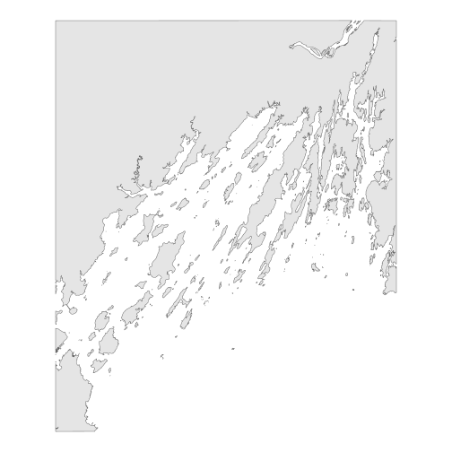
casco_coastline <- st_crop(maine_borders, aoi_boundary_casco)
ERROR
Error in wk_handle.wk_wkb(wkb, s2_geography_writer(oriented = oriented, : Loop 0 is not valid: Edge 47287 has duplicate vertex with edge 47329This does not always go well with data sets from the wild. Without
getting too deep into it, vector files (particularly polygons) can have
a variety of issues in them which make them invalid. To fix this, we
need to make them valid before cropping with
st_make_valid(). Odd, but, this is incredibly common.
R
casco_coastline <- st_crop(maine_borders |> st_make_valid(),
                           aoi_boundary_casco)

ggplot() +
  geom_sf(data = casco_coastline) +
  coord_sf() +
  theme_void()
R
roads_maine <- st_read("data/maine_gov_maps/MaineDOT_Public_Roads/MaineDOT_Public_Roads.shp")
OUTPUT
Reading layer `MaineDOT_Public_Roads' from data source
  `/home/runner/work/r-raster-vector-geospatial/r-raster-vector-geospatial/site/built/data/maine_gov_maps/MaineDOT_Public_Roads/MaineDOT_Public_Roads.shp'
  using driver `ESRI Shapefile'
Simple feature collection with 100669 features and 30 fields
Geometry type: LINESTRING
Dimension:     XY
Bounding box:  xmin: -71.04662 ymin: 43.06728 xmax: -66.95202 ymax: 47.35999
Geodetic CRS:  WGS 84
R
roads_casco <- st_crop(roads_maine, aoi_boundary_casco)

ggplot() +
  geom_sf(data = roads_casco)
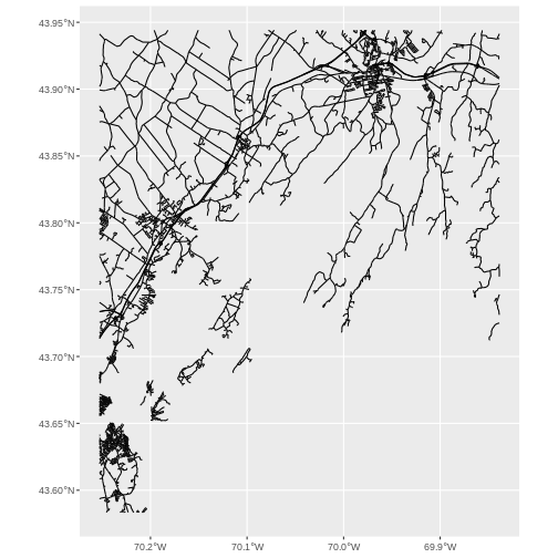
Lovely! Now let’s start bringing seagrass in.
Plotting Multiple Vector Layers
In the previous episode, we learned how to plot information from a single vector layer and do some plot customization including adding a custom legend. However, what if we want to create a more complex plot with many vector layers and unique symbols that need to be represented clearly in a legend?
Now, let’s create a plot that combines our seagrass beds
(seagrass_casco_2022), the coastline
(casco_coastline) and roads (roads_maine)
spatial objects. We will need to build a custom legend as well.
To begin, we will create a plot with the coastline as the base layer with a tan fill and a black outline. We will add on top roads, but with alpha = 0.1 so they are faint. Last, we will layer seagrass beds on top with color and fill as percent cover and a linewidth of 1.3. We will save it as an object so we can make small changes from here on out.
R
seagrass_map <- ggplot() +
  geom_sf(data = casco_coastline, fill = "tan", color = "black") +
  geom_sf(data = roads_casco, alpha = 0.1) +
  geom_sf(data = seagrass_casco_2022,
          mapping = aes(color = Cover_Pct,
                        fill = Cover_Pct),
          linewidth = 1.3) +
  scale_color_brewer(palette = "Greens") +
  scale_fill_brewer(palette = "Greens")

seagrass_map
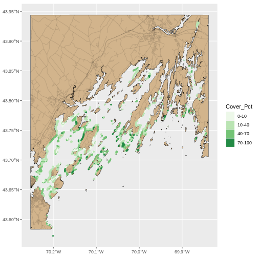
This looks OK, but, let’s dial things up a bit. Let’s
- Eliminate the gap around the plot with an argument
expand = FALSEtocoord_sf(). - Give it a cleaner theme with
theme_classic() - Give the map a name and the fill/color legend a name.
- Use
theme()to make it more ocean-y with a
We can start by making the plot cleaner and eliminating the gap (1 & 2)
R
seagrass_map <- seagrass_map +
  coord_sf(expand = FALSE) +
  theme_classic()

seagrass_map
Now lets adjust the legend titles by using labs().
R
seagrass_map <- seagrass_map +
  labs(color = "% Cover", fill = "% Cover",
       title = "Seagrass in Casco Bay in 2022")

seagrass_map
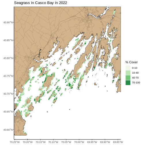
Last, we can use theme() to add a light blue background
and rotate the X axis. We will save this as an object, so we don’t need
to type more as we make further modifications.
R
seagrass_map <- seagrass_map  +
  theme(panel.background = element_rect(fill = "lightblue"),
        axis.text.x = element_text(angle = 45, hjust = 1))

seagrass_map
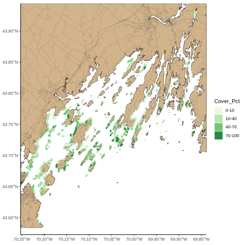
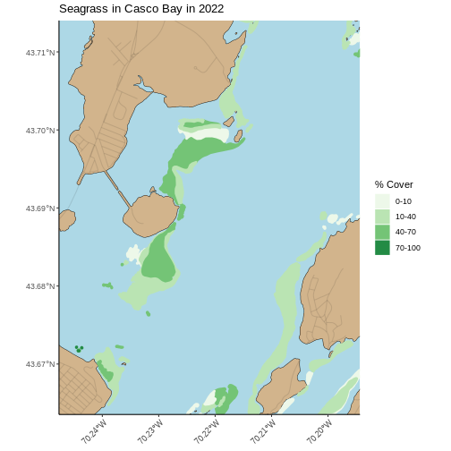
Zooming In
This map looks great, but, there’s a lot of data here. While it can provide a great big-picture overview, it’s hard to see more small-scale features. There are two solutions to this. The first is plotting the map zoomed in to an area of interest. You can get your AOI either by eyeballing the corner coordinates (x and y min and max) from the plot itself, or use something like https://maps.google.com and right click to get point coordinates.
Using the later method, here, for example, is the area around Mackworth Island.
R
seagrass_map +
  coord_sf(xlim = c(-70.24768051612979, -70.19432151530208),
           ylim = c(43.66353031177649, 43.714022044471584),
           expand = FALSE)
The second answer is an interactive map with leaflet. This is
slightly more challenging to implement, but very similar to what we did
with rasters before. We will start by making a color palette for the
map. We can use colorFactor() as we have discrete classes
here.
R
library(leaflet)

seagrass_pal <- colorFactor(palette = "Greens",
                         domain = seagrass_casco_2022$Cover_Pct)
From here, we can build a leaflet map. Let’s use
addProviderTiles("Stadia.AlidadeSmooth") for a very neutral
background. We add sf polygons using
addPolygons(). For this, we need to think about the what is
creating polygon borders and the fill. We will set
stroke = FALSE so we don’t have to worry about the border
(too many more argument) and instead use our palette - which is now a
function to be evaluated with ~ and set a
fillOpacity to 1, for fully opaque.
R
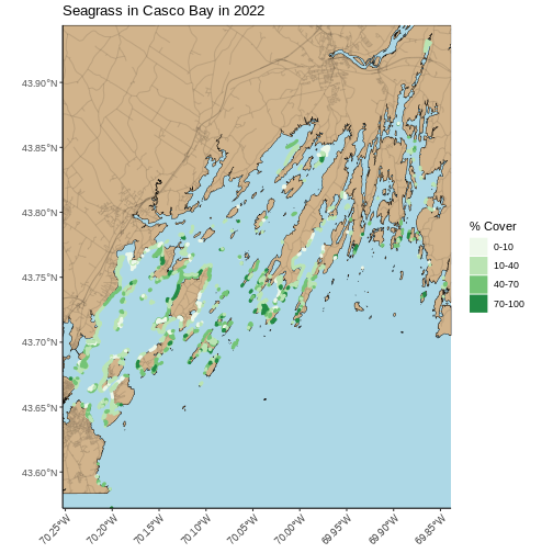
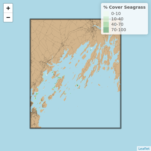
leaflet() |>
 addProviderTiles("Stadia.AlidadeSmooth") |>
  addPolygons(data = seagrass_casco_2022,
              fillColor = ~seagrass_pal(Cover_Pct),
              fillOpacity = 1,
              stroke = FALSE)

Note, you can recreate what you did with the ggplot2
above just using the sf objects. We’ll need to invoke one
trick from the leaflet.extras package to get that blue
background.
R
library(leaflet.extras)

leaflet() |>
  addPolygons(data = casco_coastline,
              fillColor = "tan",
              fillOpacity = 1,
              stroke = FALSE) |>
  addPolylines(data = roads_casco,
               color = "black",
               opacity = 0.1,
               weight = 1) |>
  addPolygons(data = seagrass_casco_2022,
              fillColor = ~seagrass_pal(Cover_Pct),
              fillOpacity = 1,
              stroke = FALSE) |>
  addPolygons(data = aoi_boundary_casco,
              color = "black",
              fillOpacity = 0) |>
  setMapWidgetStyle(list(background= "lightblue")) |>
  addLegend(pal = seagrass_pal,
            values = seagrass_casco_2022$Cover_Pct,
            title = "% Cover Seagrass")
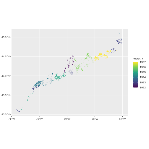
Challenge: Let’s Part Like it’s 1997… er, 1993-1994
The earliest seagrass datat available from Maine’s Geolibrary is their 1997 State-Wide Data aggregated from photography from 1992 - 1997. Load up the ESRI
shapefilefromdata/maine_gov_seagrass/MaineDMR_-_Eelgrass-1997-shpand do a quick visualization showing where was surveyed when.Crop it down to Casco Bay and make a plot showing the area around Mackworth Island. Make sure your title reflects what years are being represented. While there is a cover classification (from 0-5) based on percent cover, the metadata doesn’t have the lineup. Still, qualitatively, how does this compare to 2022? Use whatever technique you’d like to visualize this small area. Note,
COVERis continuous, so to make it into distinct classes you will needas.character(COVER)in your code.
- First we need to load in the data. Let’ see how many years are here.
R
seagrass_1997 <- st_read("data/maine_gov_seagrass/MaineDMR_-_Eelgrass-1997-shp/MaineDMR_-_Eelgrass.shp")
OUTPUT
Reading layer `MaineDMR_-_Eelgrass' from data source
  `/home/runner/work/r-raster-vector-geospatial/r-raster-vector-geospatial/site/built/data/maine_gov_seagrass/MaineDMR_-_Eelgrass-1997-shp/MaineDMR_-_Eelgrass.shp'
  using driver `ESRI Shapefile'
Simple feature collection with 7519 features and 10 fields
Geometry type: POLYGON
Dimension:     XY
Bounding box:  xmin: -70.82449 ymin: 43.05945 xmax: -66.98462 ymax: 45.11247
Geodetic CRS:  WGS 84
R
# what are the names
names(seagrass_1997)
OUTPUT
 [1] "OBJECTID_1" "OBJECTID"   "COVER"      "LOCATION"   "ACRES"
 [6] "HECTARES"   "Year97"     "GlobalID"   "Shape__Are" "Shape__Len"
[11] "geometry"
R
# what are the unique years
unique(seagrass_1997$Year97)
OUTPUT
[1] 1993 1994 1997 1996 1992 1995Then, we can visualize.
R
ggplot() +
  geom_sf(data = seagrass_1997,
          aes(color = Year97, fill = Year97)) +
  scale_color_viridis_c() +
  scale_fill_viridis_c()
- For the second piece, first, we need to crop to Casco Bay and check what years this data consists of.
R
seagrass_casco_1997 <- st_crop(seagrass_1997 |> st_make_valid(),
                              aoi_boundary_casco)

unique(seagrass_casco_1997$Year97)
OUTPUT
[1] 1994 1993With the cropped polygons, we can make a map akin to what we did above for 2022. We can even re-use our code, but with a few small modifications for a different data set and a different cover type.
R
ggplot() +
  geom_sf(data = casco_coastline, fill = "tan", color = "black") +
  geom_sf(data = roads_casco, alpha = 0.1) +
  geom_sf(data = seagrass_casco_1997,
          mapping = aes(color = as.character(COVER),
                        fill = as.character(COVER)),
          linewidth = 1.3) +
  scale_color_brewer(palette = "Greens") +
  scale_fill_brewer(palette = "Greens") +
  theme_classic() +
  labs(color = "Cover Class", fill = "Cover Class",
       title = "Seagrass in Casco Bay in 1993 and 1994") +
  coord_sf(xlim = c(-70.24768051612979, -70.19432151530208),
           ylim = c(43.66353031177649, 43.714022044471584),
           expand = FALSE) +
  theme(panel.background = element_rect(fill = "lightblue"),
        axis.text.x = element_text(angle = 45, hjust = 1))
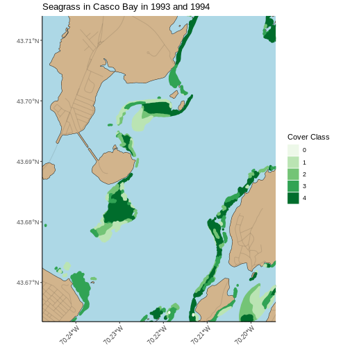
While we cannot know how the beds compare exactly, given that we do not know how the Cover Class maps to % Cover, it appears that many of the beds in 1993 and 1994 are at the highest class of cover, while in 2022 they are at the high-middle.